
TRON DAO Design Challenge - process in review
“Create an imaginary campaign on a subbrand called TRON IMPACT that brings awareness to the communities, businesses, and people that TRON directly helps through everyday stablecoin transactions and payments. Think about how photography, imagery, and graphics are used and the overall photo/art direction while conveying this message.”
When I began the TRON IMPACT design challenge, I knew this wasn’t just about creating visuals — it was about building a bridge between advanced blockchain technology and the people whose lives it can meaningfully improve. This project was an opportunity to define a sub-brand that would speak directly to a specific audience, feel aligned with TRON’s core identity, and deliver a campaign that could live across multiple mediums.
Understanding the Audience
Based on external research, TRON’s most relevant user segment for this project is mobile-first (~68%) millennial men (~60%), typically aged 20–30 and in the middle-income bracket. Many of these users are gig workers or individuals who send stablecoin assets like USDT globally — whether for payments, remittances, or cross-border work.
Knowing this, the assets I designed were tailored to appeal to a young, on-the-go audience, with high visibility and broad appeal. The goal was to ensure that every brand touchpoint felt relevant to their lifestyles, whether encountered on a commute, in an app, or while browsing online.
Crafting the Messaging
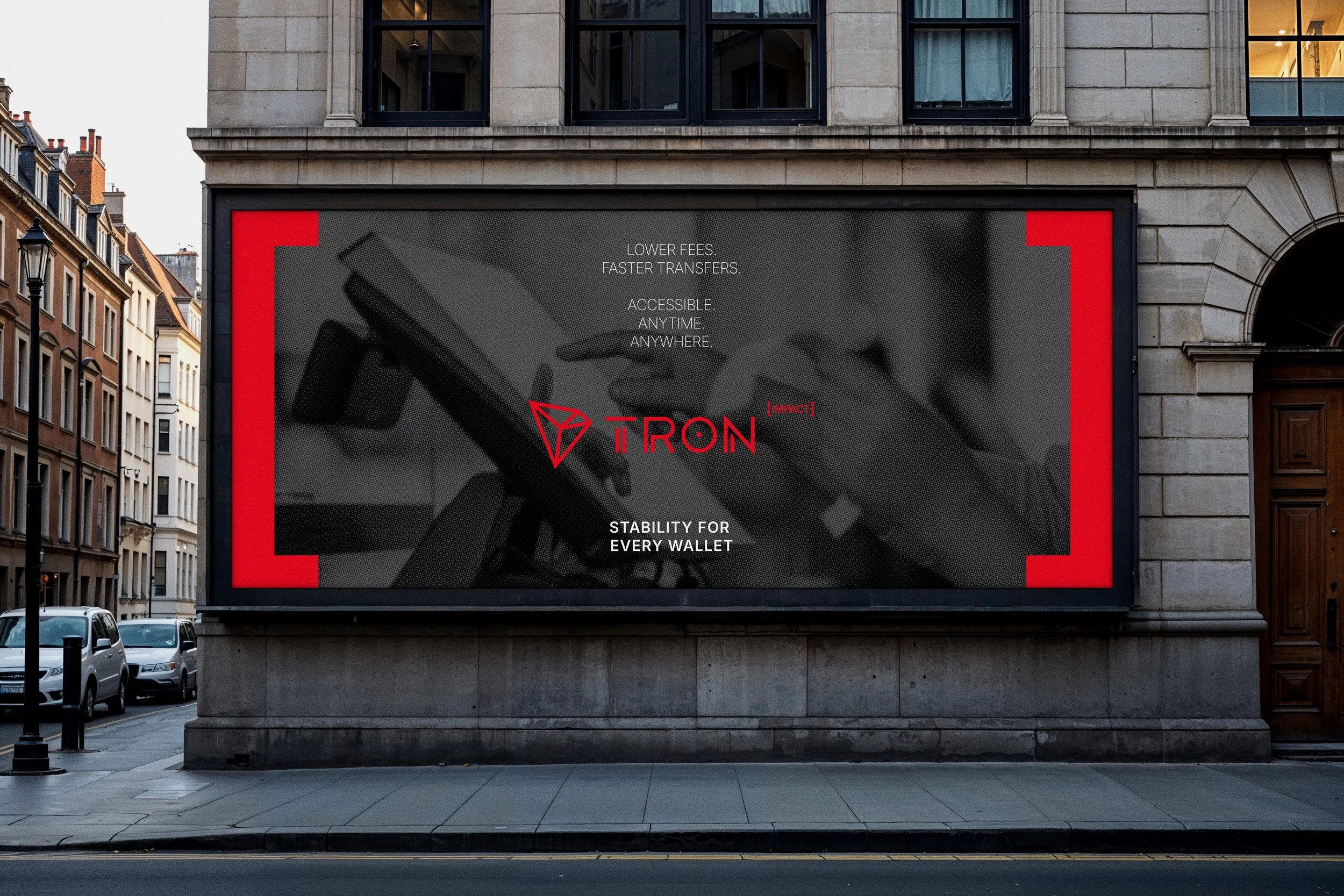
To build trust with this audience, I distilled the benefits of stablecoins into three core attributes: fast, affordable, and reliable. From this foundation came the tagline: “Stability for Every Wallet”, supported by the secondary line: “Lower fees. Faster transfers. Accessible. Anytime. Anywhere.”
These lines became the anchor for all campaign messaging, ensuring that even the quickest glance would communicate clear value and real-world utility.
Building the Sub-Brand
The TRON IMPACT sub-brand needed to do two things: help individuals succeed while also elevating TRON’s core identity. I created a modern wordmark that connects to the primary brand as an exponent of success, giving the sub-brand flexibility to integrate across existing TRON assets and scale for different contexts.
The color palette was intentionally narrowed to red, black, and white for ease of use and strong visual recognition. For scenarios where legibility might be a challenge, the brand can adapt to a logo pairing or a standalone mark, maintaining consistency across all touchpoints.

Defining the Visual Direction
Once the foundational brand elements — logo, color, and typography — were in place, I turned to the campaign’s look and feel. The challenge was clear: the imagery had to be human and tangible, yet tech-forward enough to align with TRON’s identity.
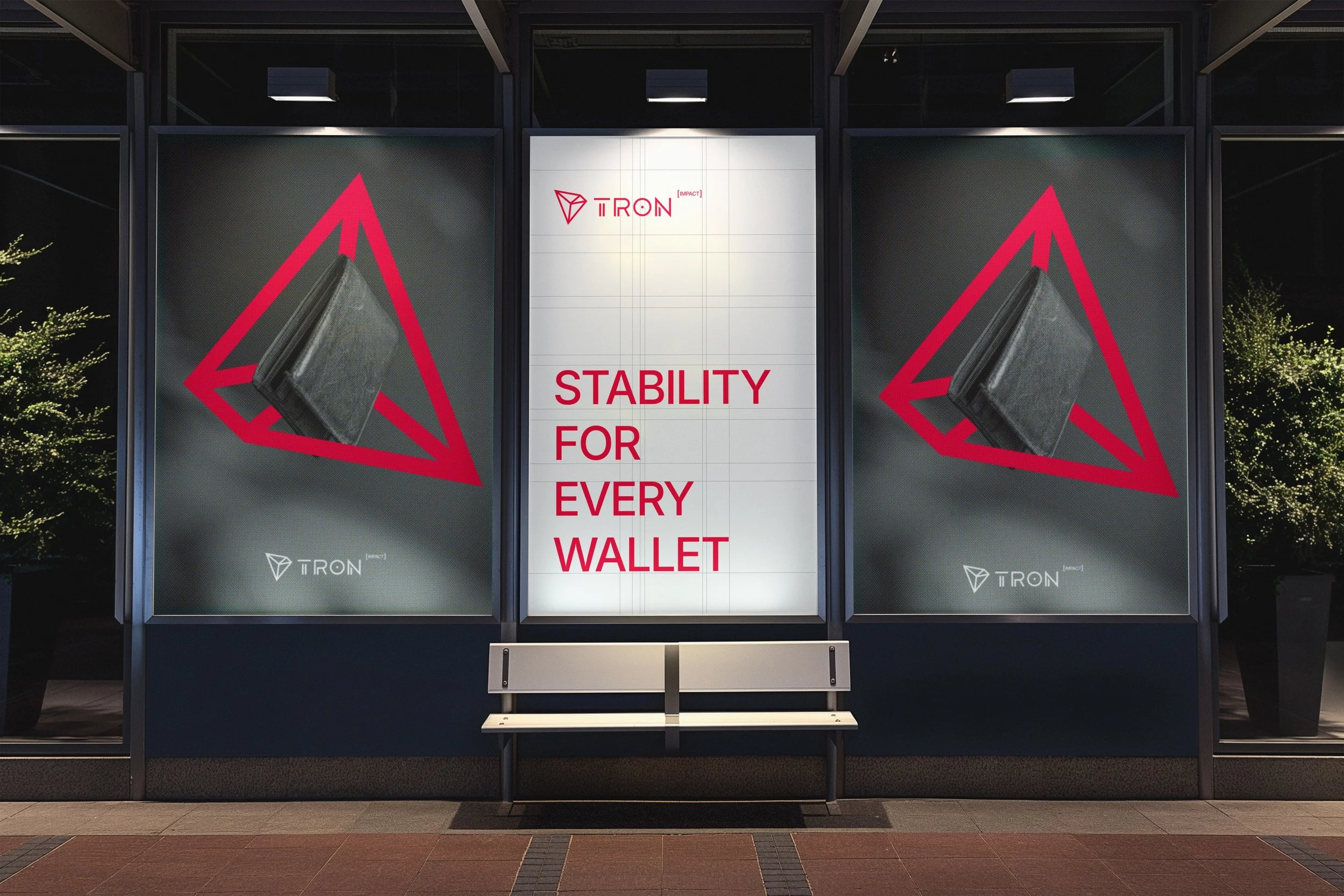
I initially explored surreal photography, drawn to its vibrancy and emotional pull, but found it too abstract for the average user. Wide-angle portraits became the better fit — dynamic, authentic, and age-appropriate, offering diversity in landscapes, expressions, and energy. To add context and variety, I paired these portraits with physical wallet shots, connecting the human moments to the financial utility at the heart of TRON IMPACT.

Merging the Elements
With the logo, color palette, and photography defined, the next step was merging them into a cohesive brand system. While the wide-angle shots were visually compelling, they sometimes felt inconsistent. Leaning into the color palette solved this — desaturating images brought them closer to the brand’s tone, while still allowing the red accents to stand out.
I also developed graphic elements to support the system: halftones, a grid derived from the TRON logo’s geometry, and brackets from the IMPACT mark. Combined, these pieces created a high-energy, clean, and scalable visual system that can adapt across a wide range of assets.

Showcasing the Brand in Action
The first asset I designed to bring TRON IMPACT to life was a long-form Annual Report. This versatile piece could be used at tradeshows, as gated website content, or as a sales asset for high-profile investors.
I built the layouts on a four-column grid, integrating trending photography and clean data visualization to highlight key statistics. The cover features a secondary brand mark, and the generous use of whitespace gives the piece a modern, open, and inviting feel.


Targeting Mobile-First Users
With most TRON users accessing content on mobile devices, the campaign needed to meet them where they already spend their time — social media platforms and communication apps like WhatsApp.
The mobile ads are simple, direct, and designed to carry TRON IMPACT’s brand principles: simplicity, legibility, energy, and youthfulness. They use the same system of imagery, typography, and graphic elements, ensuring brand recognition even in fast-scrolling environments.

High-Visibility Out-of-Home
The final touchpoint in the campaign strategy was high-visibility billboard placements in areas with heavy gig worker traffic. These are designed to reach audiences at the top of the funnel, building general brand awareness and creating familiarity with TRON IMPACT before users ever interact with its digital touchpoints.


Conclusion
This project was about more than building a set of campaign assets — it was about creating a sub-brand that connects blockchain technology to everyday life. By grounding the creative direction in real user demographics, focusing on clarity and trust in messaging, and building a cohesive visual system, TRON IMPACT is positioned to speak directly to its audience in the spaces where they live, work, and connect.
From wide-angle portraits to bold typography, every decision was made to balance humanity and technology — creating a campaign that is not only visually striking, but strategically aligned with TRON’s mission of financial accessibility for all.