Evolving TRON DAO: Building a Scalable Brand System from Chaos
Design systems rarely start with a clean slate; more often, they begin with a puzzle. When I originally joined TRON DAO as a brand contract designer, the goal was to help evolve and rebrand the identity. However, right as I stepped in, a cross-continental miscommunication between the US and China teams resulted in the CN team launching a micro-rebrand. The result? A fragmented, piecemeal design system that felt convoluted and impossible to scale. To make matters more intense, the entire US brand operation was being carried by just one internal brand designer.
Rather than hitting the pause button, we used the friction as an opportunity to build real cohesion.
Auditing the Ecosystem
The lead US brand designer and I immediately joined forces. We began by pulling every existing asset, social post, presentation deck, and visual reference across both regions into a massive FigJam board. Seeing everything side-by-side made the core issues clear: while individual graphics looked great, the overall visual language lacked unified rules.
We brought these insights to leadership, using the board to highlight where the inconsistencies were actively slowing team velocity down. Together, we defined a clearer visual trajectory—one that respected the momentum of the recent update while instilling much-needed structure.
The 9 Brand Categories
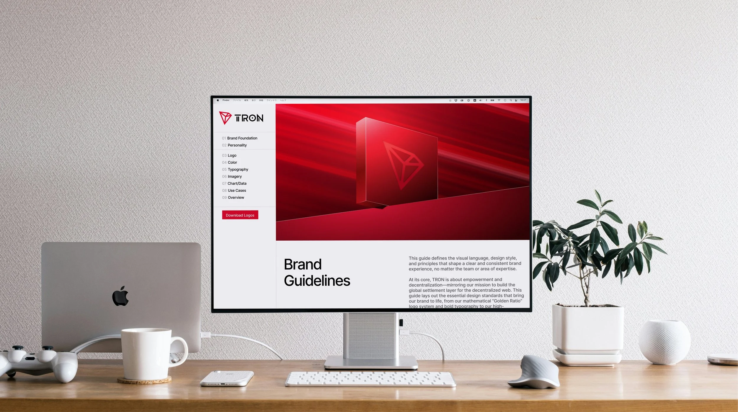
To turn a scattered asset library into a scalable framework, we distilled the brand guidelines down into nine clear, foundational categories.
1. Brand Foundation & Strategy
We grounded the visual identity in clear narrative pillars. Defining high-level positioning ensured that every piece of creative work—from global summit graphics to day-to-day developer posts—anchored back to the core mission.
2. Personality & Voice
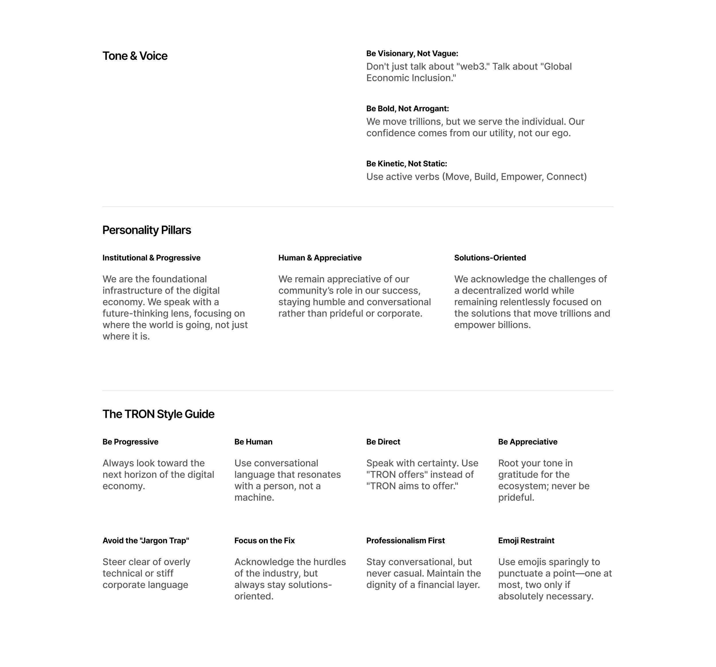
A design system isn’t just visual; it dictates how a brand speaks. We codified tone and voice standards into actionable guidance: Be Visionary, Not Vague, Be Bold, Not Arrogant, and Be Kinetic, Not Static. We also established explicit style rules—avoiding the "jargon trap," practicing emoji restraint, and prioritizing clarity over corporate fluff.
3. Logo Systems & Clearspace
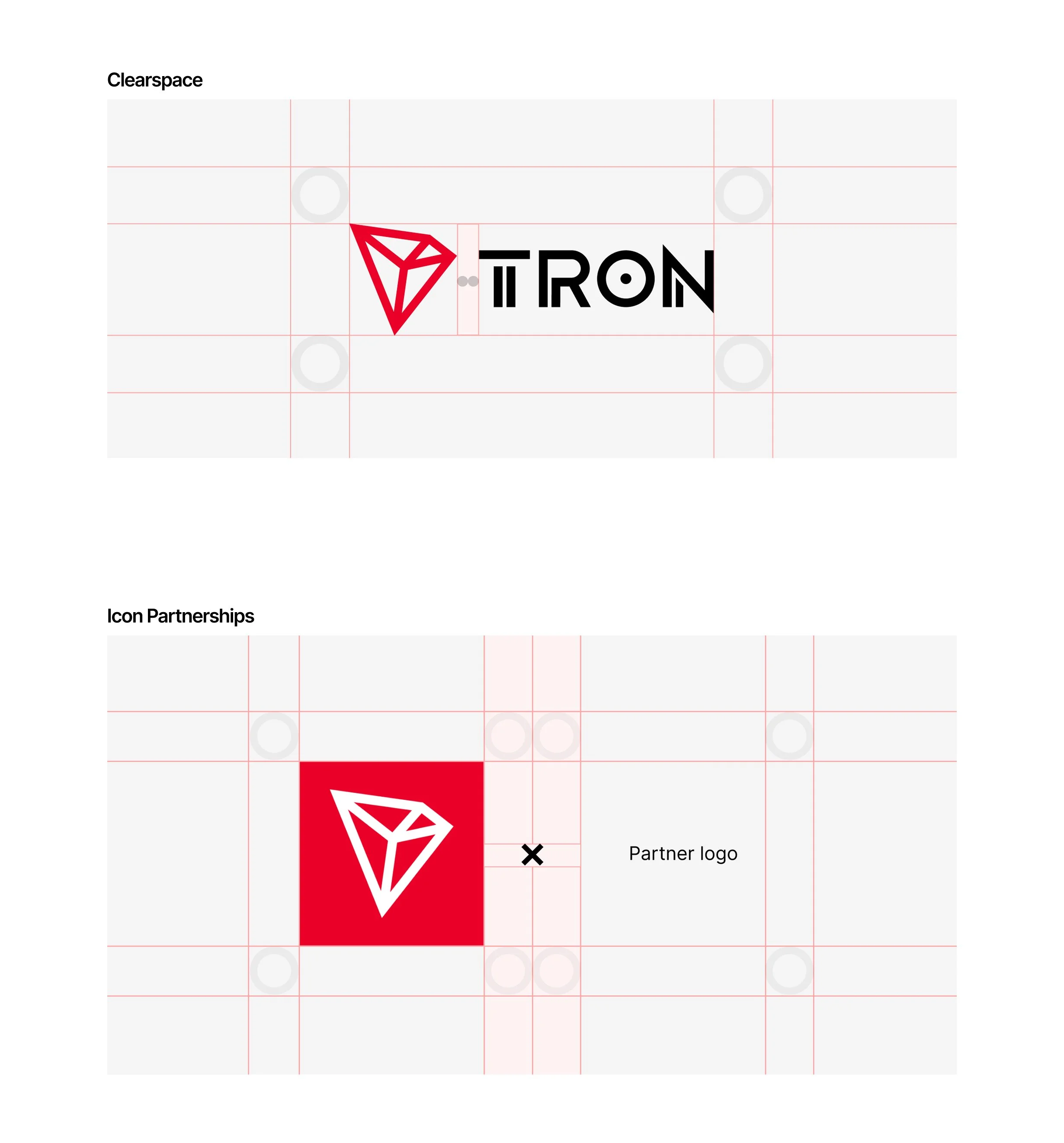
To protect the logo across global executions and co-branding opportunities, we defined rigid technical clearspace rules using structural grid lines. We also created standardized guidelines for icon partnerships and dual-logo lockups.
4. Color Palette & Ratios
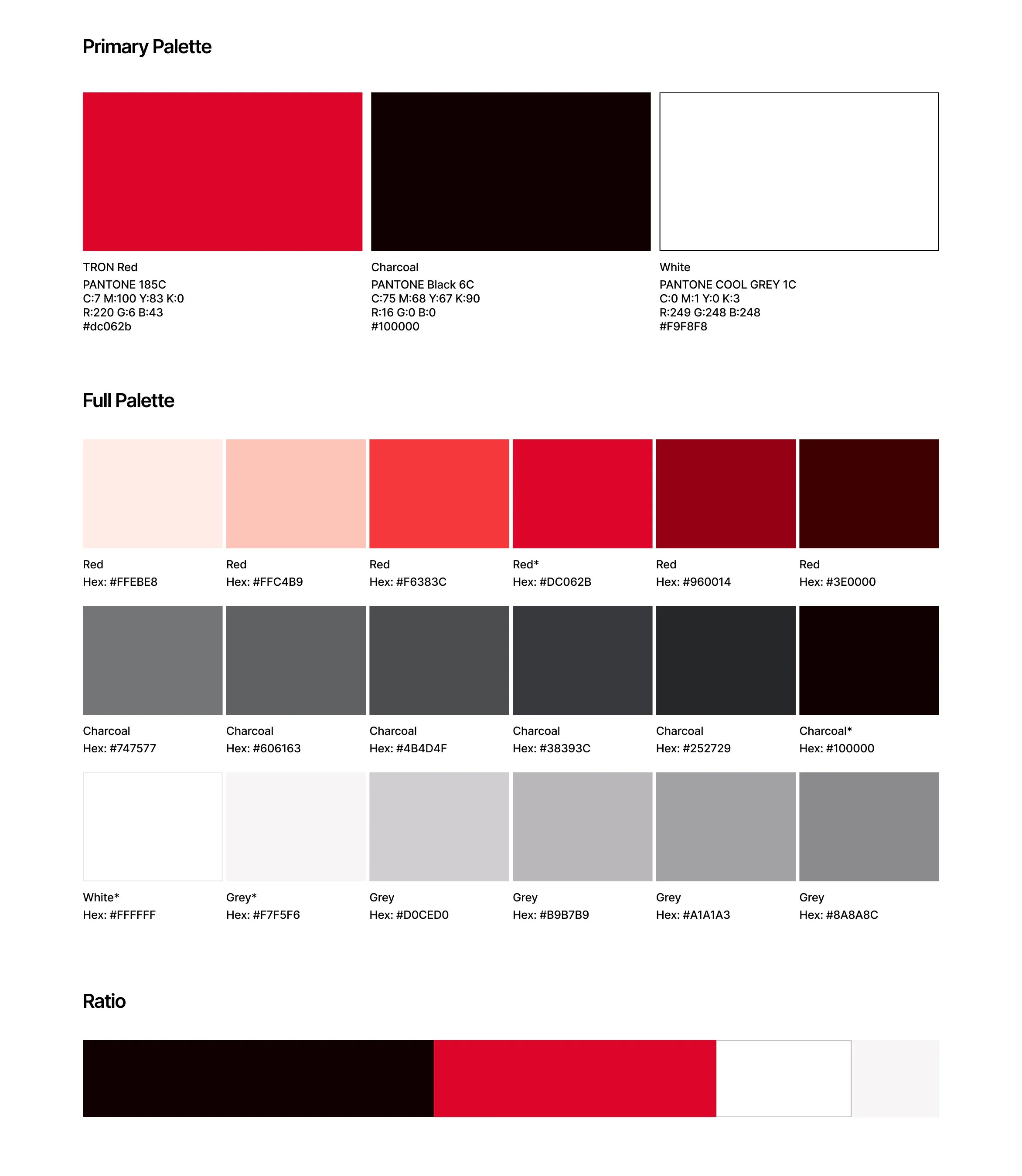
To resolve the regional color discrepancies, we established a definitive palette hierarchy: TRON Red (PANTONE 185C / #dc062b), Charcoal (PANTONE Black 6C / #100000), and clean White/Grey neutrals. Crucially, we included precise usage ratios to ensure marketing materials maintained the ideal contrast and weight.
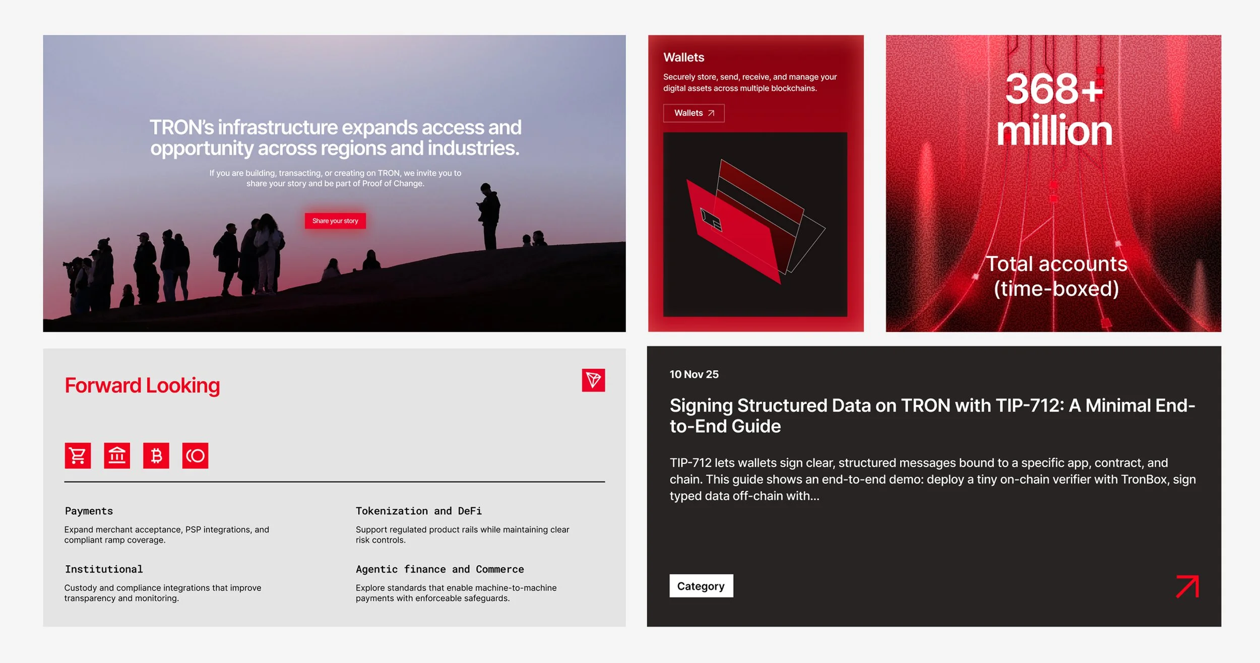
5. Typography & Layout Grids
Typography hierarchy needed to feel structured yet adaptable across different aspect ratios and media formats. We developed flexible layout grids showing how hero typography, copy blocks, and 3D imagery should scale—whether at 100%, 75%, or 50% image crop rules.
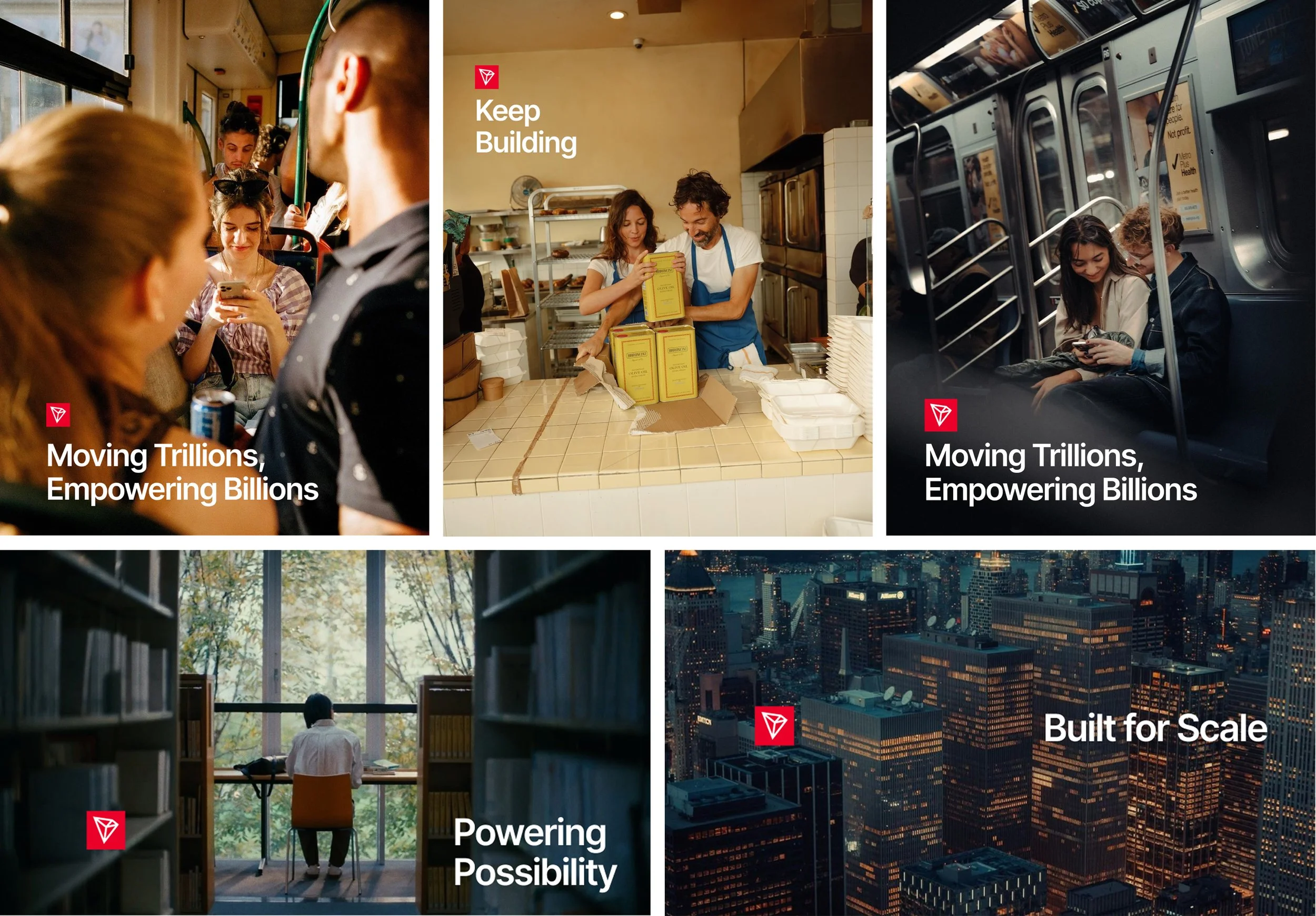
6. Imagery & Photography Direction
We defined a warm, human-centric photography style to ground the high-tech layer of Web3 in real-world impact. Guidelines cover candid expressions, natural lighting, and subtle, contextual logo placements that feel organic rather than forced.
7. Data Visualization & Charts
Web3 is powered by data, but raw metrics can quickly overwhelm users. We created standard UI patterns, data cards, and chart styles for key metrics like transaction volumes, active accounts, and technical updates.
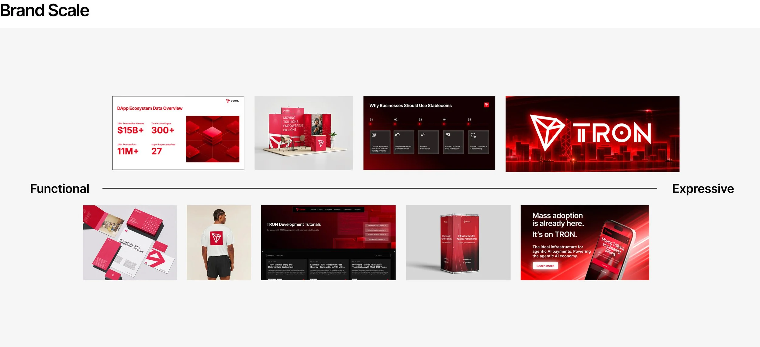
8. Use Cases & Brand Scale
To help creators know when to turn the volume up or down, we mapped creative execution along a Functional to Expressive spectrum. Turn key presentations and technical documentation stay clean and functional, while campaign key art and high-impact social assets lean expressive and dynamic.
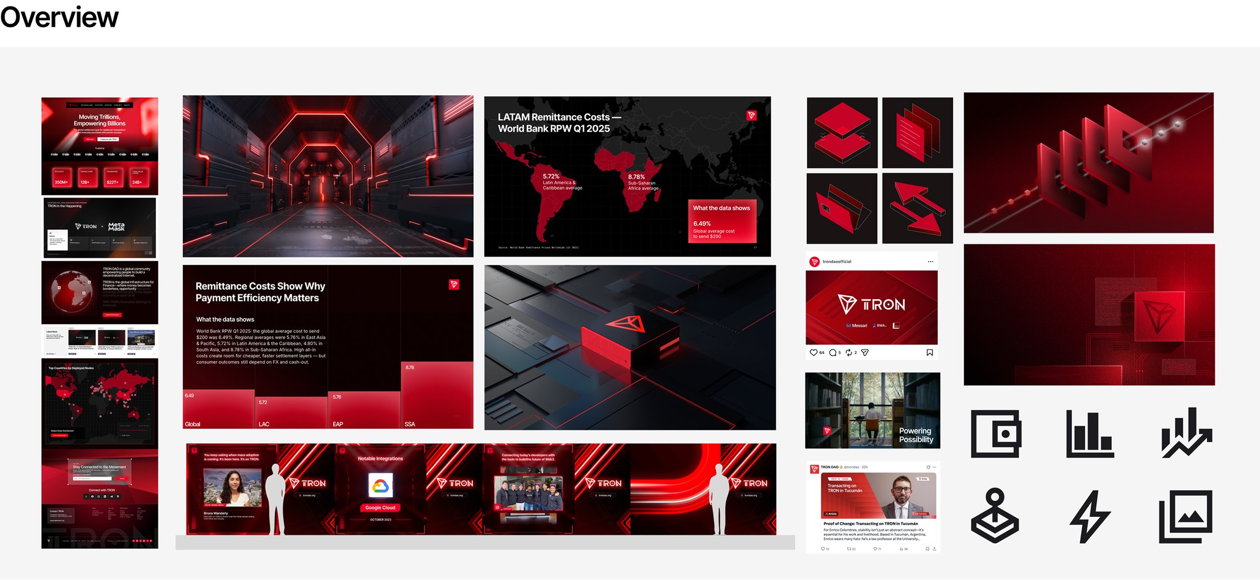
9. System Overview & Cheat Sheet
Finally, we compiled a high-level cheat sheet and quick-reference panel so internal designers, external vendors, and agency partners could grab verified icon sets, 3D assets, and templates at a glance.
Building for Speed and Growth
With the core content drafted and visuals compiled, we needed a delivery method that could evolve as fast as the ecosystem itself. Static PDFs tend to gather dust or fall out of date the moment they’re exported. Instead, we built an internal guidelines site using Figma Sites. This gave us a living, centralized hub where we could quickly update guidance, add fresh use cases, and ship adjustments in real-time as the brand grew.
Scaling the Workflow
Once the framework received the green light from both leadership and legal, we transitioned from guidelines to execution. We built robust, componentized design libraries inside Figma, creating an evergreen repository of ready-to-use assets, templates, and UI elements.
What started as a fragmented, single-designer bottleneck transformed into an organized, scalable design engine. By organizing the noise into a modular system, we gave both the US and global teams the tools, clarity, and autonomy to build consistent TRON DAO experiences moving forward.