[FUN]
If I Wasn’t a Designer, I’d Run a Food Truck
Cauli’s: the food truck brand I’d build if I ever swapped design tools for fryer baskets.
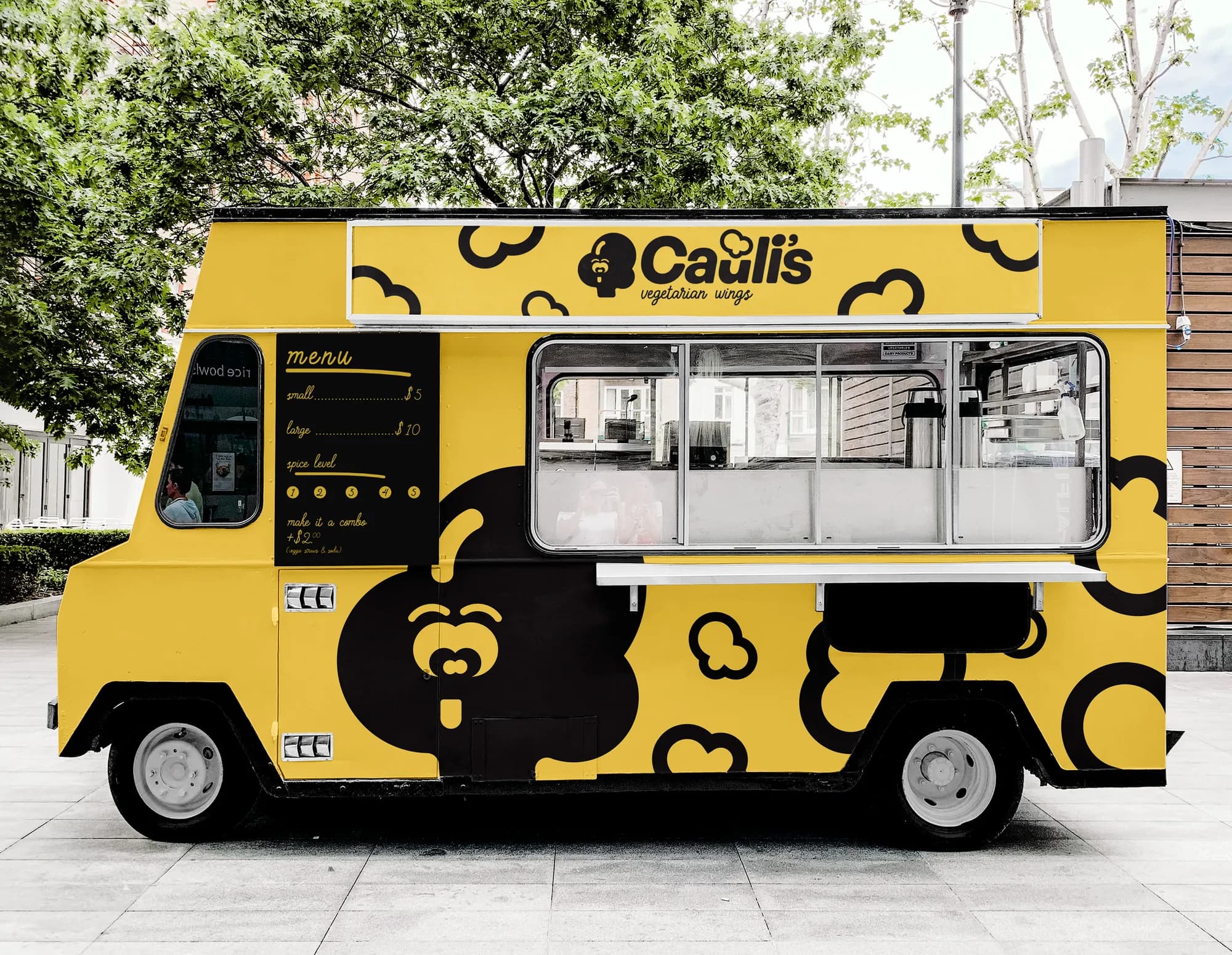
If I wasn’t a designer, there’s a good chance you’d find me parked on a downtown corner slinging cauliflower wings out of a bright yellow truck. But since I don’t know the first thing about food licensing, truck maintenance or keeping ranch cold on a summer day, this little dream is going to stay on paper.
Honestly, that’s the fun of it. Cauli’s isn’t just a food truck. It’s the food truck brand I’d build if I ever swapped design tools for fryer baskets.
Meet Cauli’s
The concept is simple: fried cauliflower wings in two sizes, small for $5 and large for $10. If you’re hungry (or just want the full experience), $2 more turns it into a combo with veggie sticks and a can of soda. Spice levels run from 1 to 5, with 1 being “my grandma could eat this” and 5 being “why did I do this to myself?” (I will personally never try a 5.)
The name Cauli’s is short, playful and easy to shout across a busy festival street. The logo leans into the humor with a cauliflower head and a cheeky face, and the type pairs bold, friendly curves with a hand-lettered tagline: vegetarian wings.
The truck
Designing the truck was probably the most fun part of this exercise. The body is drenched in a punchy yellow that demands attention from half a block away. The playful cauliflower icons repeat across the surface like polka dots, and the oversized cauliflower face anchors the design with personality.
The menu is painted directly on the truck in a hand-drawn script. It’s intentionally minimal: no confusing options, no “build your own.” Just wings, combos and spice levels. The official reason is that it keeps the line moving. The real reason is that it saves me from designing a fifty-page menu board.
The food
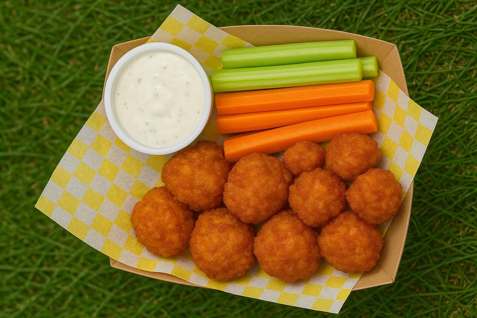
Every brand project deserves a hero shot, and this is mine. Golden-brown cauliflower wings, crisp veggie sticks and creamy ranch, all laid out in a yellow checkered tray.
It’s not real food (yet, and yes, the photo is AI-generated), but it sells the dream: affordable comfort food with a wink. The yellow is strong enough to carry the brand on its own, so there’s no need to spend money on specialty containers. Just paper boats, checkered liners and ranch cups.
Why it matters
For me, Cauli’s represents the overlap between branding and imagination. I’ll never be a food truck operator, but the principles I’d use for one (clarity, humor, bold visuals and simplicity) are the same ones I rely on every day.
The truck, the logo, the menu: they’re all playful, but they’re also consistent. Every touchpoint tells the same story. That’s the heart of good brand work, whether it’s for a SaaS platform or a cauliflower wing truck.
Cauli’s is the kind of project that reminds me why I like this job. I get to dream something up, give it a look and share it, without ever worrying about grease traps or generator maintenance.
And who knows? Maybe someday someone will take this idea and actually park it on a corner. (Entrepreneurs, I’m open to a partnership.) If they do, I’ll be first in line.